
Salesforce Lightning Record Picker: Your Complete Guide
The Salesforce Lightning Record Picker is an essential UI component in Salesforce that allows users to search for and select records from Salesforce objects in a simplified and intuitive manner. This component is part of Salesforce Lightning Web Components (LWC), providing a native and streamlined approach for users to pick records, making it ideal for a variety of use cases such as forms, record selection, and more.
Key Features of Lightning Record Picker
- User-Friendly Search Interface: It offers an autocomplete search bar for the user to easily search and select records.
- GraphQL Wire Adapter: The component uses GraphQL wire adapter to search for records to support offline use.
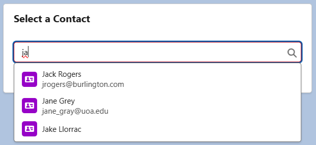
- Display Fields: At first, only the Name field is visible, but incorporating a secondary field improves the user experience by making it easier to find the right record.
- Filter Criteria: The Record Picker allows filtering of records by a variety of criteria (e.g., specific field values), helping users narrow down their search results.
- Matching Fields: By default, the search is performed on the name field of the target object. To search for a match in a different field or multiple fields, use the matching-info attribute.
- Validation Messages: Validation messages are displayed when the component loses focus or via the reportValidity() method. Custom validation messages can also be defined using setCustomValidity().
Using the Lightning Record Picker in a Contact Example
The following example demonstrates how to use the lightning-record-picker in a LWC to let users select a Contact record.
contactRecordPicker.html
<template>
<lightning-card title="Select a Contact">
<div class="slds-p-around_medium">
<lightning-record-picker label="Select a Contact"
object-api-name="Contact"
value={selectedContactId}
placeholder="Search Contacts..."
icon-name="standard:contact"
variant="label-hidden"
size="large"
onchange={handleRecordChange}>
</lightning-record-picker>
</div>
<template if:true={selectedContactId}>
<div class="slds-p-around_medium">
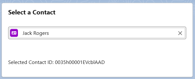
<p>Selected Contact ID: {selectedContactId}</p>
</div>
</template>
</lightning-card>
</template>contactRecordPicker.js
import { LightningElement, track } from 'lwc';

export default class ContactRecordPicker extends LightningElement {
    @track selectedContactId;

    handleRecordChange(event) {
        this.selectedContactId = event.detail.recordId;
    }
}
contactRecordPicker.js-meta.xml
<?xml version="1.0"?>
<LightningComponentBundle xmlns="http://soap.sforce.com/2006/04/metadata">
	<apiVersion>62.0</apiVersion>
	<isExposed>true</isExposed>
	<targets>
       <target>lightning__AppPage</target>
       <target>lightning__RecordPage</target>
       <target>lightning__HomePage</target>
   </targets>
</LightningComponentBundle>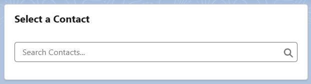
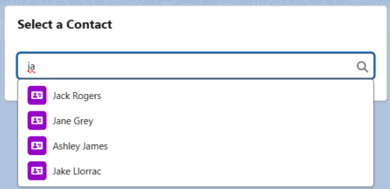
The lightning-record-picker component automatically displays a search bar, allowing users to search for Contact records.
When a user selects a contact, the onrecordchange event triggers the handleRecordChange method, which retrieves the selected record’s ID and displays it on the page.
Advanced Usage with Matching-info, Display-info, and Filters
In addition to the basic functionality, Salesforce provides enhanced features like matching-info, display-info, and filtering, which allow for a more tailored user experience.
contactRecordPicker.html
<template>
    <lightning-card title="Select a Contact">
       <div class="slds-p-around_medium">
            <lightning-record-picker label="Select a Contact"
                              object-api-name="Contact"
                              value={selectedContactId}
                              placeholder="Search Contacts..."
                              icon-name="standard:contact"
                              variant="label-hidden"
                              size="large"
                              matching-info={matchingInfo}
                              display-info={displayInfo}
                              filter={filterCriteria}
                              onchange={handleRecordChange}>
            </lightning-record-picker>

    </div>
    <template if:true={selectedContactId}>
        <div class="slds-p-around_medium">
            <p>Selected Contact ID: {selectedContactId}</p>
        </div>
    </template>
    </lightning-card>
</template>
contactRecordPicker.js
import { LightningElement, track } from 'lwc';

export default class ContactRecordPicker extends LightningElement {
    @track selectedContactId;

    handleRecordChange(event) {
        this.selectedContactId = event.detail.recordId;
    }

    matchingInfo = {
        primaryField: { fieldPath: 'Name', mode: 'startsWith' },
        additionalFields: [{ fieldPath: 'Phone' }],
    };

    displayInfo = {
        primaryField: 'Name',
        additionalFields: ['Email'],
    };

    filter = {
        criteria: [
            {
                fieldPath: 'LeadSource',
                operator: 'eq',
                value: 'Web'
            },
            {
                fieldPath: 'Department',
                operator: 'ne',
                value: 'Administration'
            }
        ],
        filterLogic: '(1 OR 2)',
    };
}
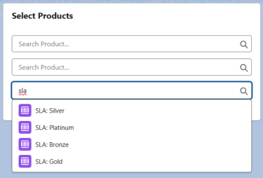
Using Lightning Record Picker in a Loop
In some cases, you might want to render multiple Record Picker components, such as when displaying a list of items that require users to select related records. You can dynamically create these components using a loop.
multiProductRecordPicker.html
<template>
    <lightning-card title="Select Products">
       <div class="slds-p-around_medium">
        <template for:each={productList} for:item="product" for:index="index">
            <div key={product.lineNumber} class="slds-grid slds-wrap slds-m-bottom_small">
                <div class="slds-col slds-size_1-of-1">
                <lightning-record-picker label="Product"
                                    placeholder="Search Product..."
                                    object-api-name="Product2"
                                    variant="label-hidden"
                                    value={product.productId}
                                    onchange={handleProductChange}
                                    data-index={index}>
                </lightning-record-picker>
                </div>
            </div>
        </template>
    </div>
    </lightning-card>
</template>
multiProductRecordPicker.js
import { LightningElement, track } from 'lwc';

export default class MultiProductRecordPicker extends LightningElement {
    @track productList = [];

    connectedCallback() {
        this.initializeProducts();
    }

    initializeProducts() {
        this.productList = [];
        for (let i = 0; i < 3; i++) {
            this.productList.push({
                lineNumber: i,
                productId: ''
            });
        }
    }

    handleProductChange(event) {
        const index = event.target.dataset.index;
        this.productList[index].productId = event.detail.recordId;
    }
}
Summary
This article has hopefully provided a clear understanding of how to use the Lightning-record-picker component in Salesforce LWC. As a result, it enables efficient record selection and, ultimately, offers a better user experience.
Make sure to leave your feedback or any questions in the comments below!